

Merch is supposed to be simple. Pick a logo, slap it on a hoodie, done. That’s not quite how it went for us.
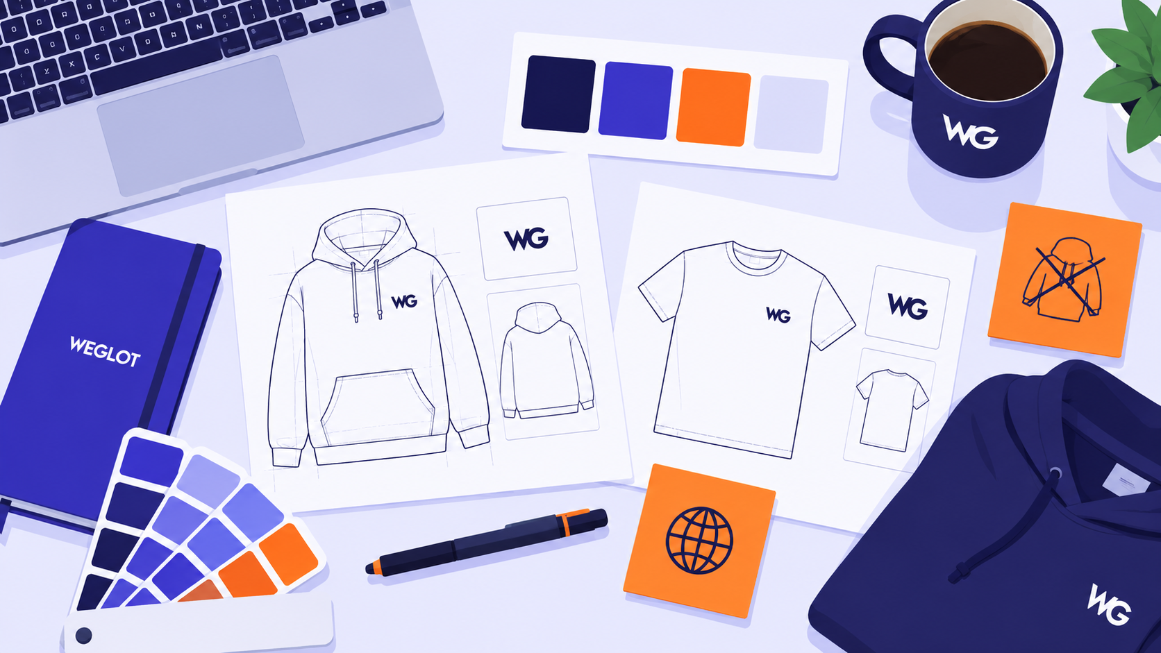
The first version of this collection was, honestly, a little boring. A plain logo tee, a plain logo cap, a plain logo mug. Functional, forgettable, the kind of thing that ends up at the bottom of a drawer by March. Somewhere in the second brainstorm, someone on the team asked a better question: what would someone who actually loves using Weglot want to wear? Not a logo. A joke they’d get immediately, and nobody else would.
That’s where things got fun. The “Not Google Translate” tee came from a running joke in our sales team’s group chat, where someone screenshots that question from a prospect call roughly once a week. The Now Loading tee started as a design mockup for something totally unrelated, and the loading bar stuck at 87 percent turned out to be a better metaphor for “international growth” than anything we’d written on purpose.
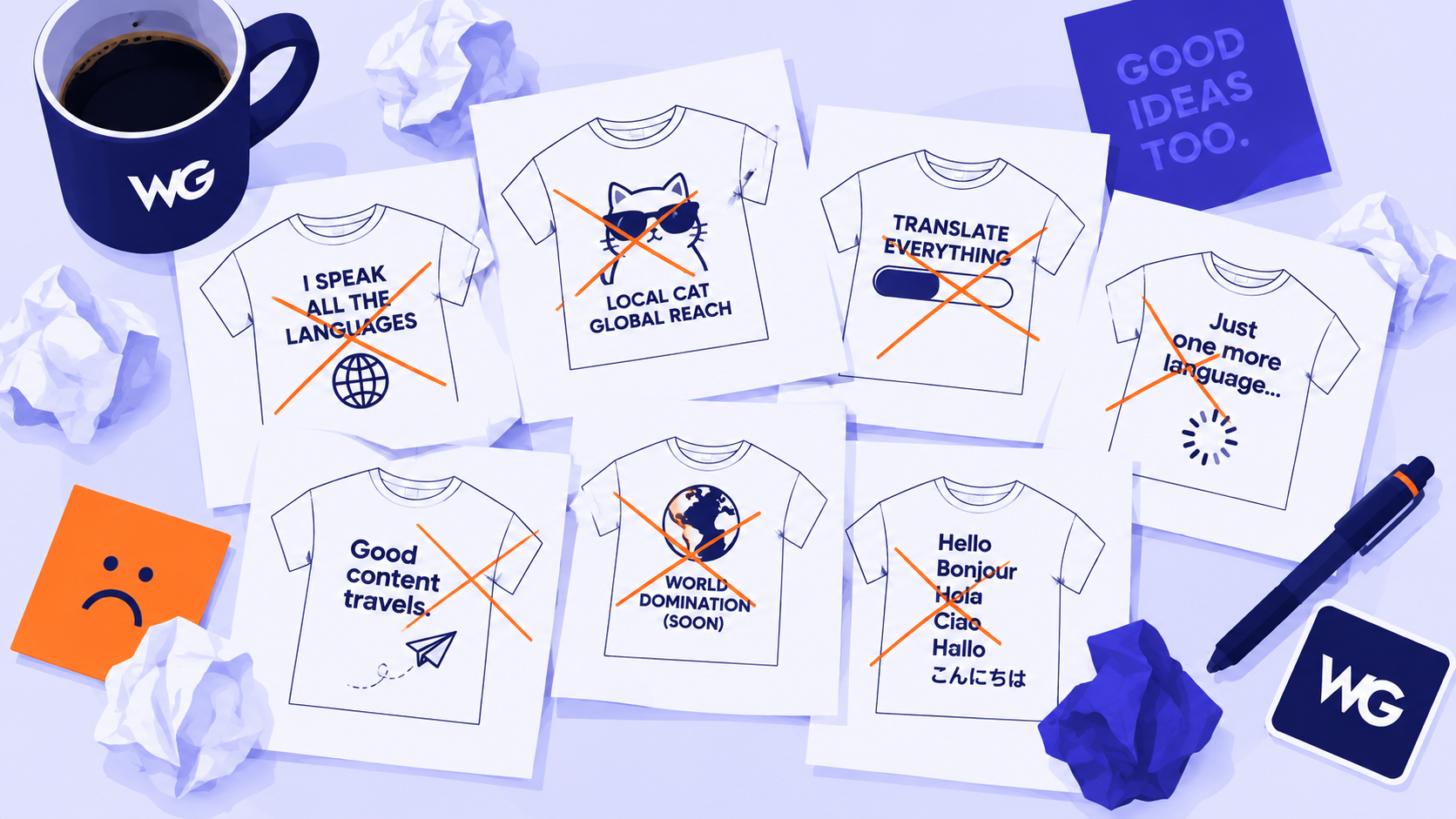
We also argued, a lot, about what not to include. An early draft had a phone case with a QR code that linked to a fake “translate this call” gag. It didn’t survive user testing (nobody understood it, including half our own team). Some ideas are better left in the group chat.
What we landed on is a collection that’s less “corporate swag” and more “things our actual customers would wear without being asked.” If you’re holding one of these products right now, you’re basically proof the plan worked.
Leave a Reply